skip to main |
skip to sidebar
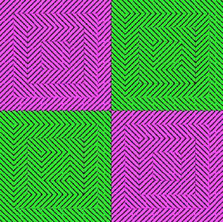
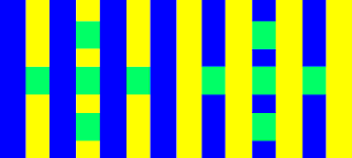
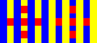 An optical illusion is when images are placed in a certain position which causes the image to be misleading. The information that is then collected by the eye is processed by the brain and makes the brain think that it is seeing something completely different. A physiological illusion is where the effects on the eyes and brain of excessive stimulation of a specific type (brightness, the tilt, the color, movement). A cognitive illusion is when the eye and brain make unconscious conclusions from evidence or reasoning. Color optical illusions are caused by the different colors being placed next to each other. Many optical illusions are errors of sense, judgment, defects of the optical system, and many are caused my certain characteristics of the visual process.
Simultaneous Contrast is when one color is placed on two separate colors that are placed next to each other. The one color then appears to be two separate colors due to brightness and contrast. This can also be done using shades.
After images are when someone stares at brightly colored objects for 30 seconds and then quickly switches to a white surface where the inverse of the original image is shown. This is caused by fatigue of the visual process. Therefore after images are best seen when eyes are well rested.
However these are just a few examples of optical illusions. Optical illusions can be caused by several different conditions, whether it be placement, color, shades, and the viewers specific eye.
http://www.colorcube.com/illusions/scstripe.htmhttp://www.colorcube.com/illusions/optiart.htm http://www.visualillusion.net/Chap09/Page01.php
http://en.wikipedia.org/wiki/Optical_illusions
Composition is the organization of a space. Artists, no matter what medium is used, use composition for every piece they produce.
During my art classes over the past couple of summers, I was told twice that there are 72 elements of composition. The same teacher that I had that told me this also told me that he has only come up with about 50 of them. My class there then attempted to find them all.
However I don't remember them all. A few are color scheme, line, space, texture, negative space, balance, focal point, and value.
There are five different kinds of color schemes. They are monochromatic, analogous, complementary, split-complementary, and tetradic.
The monochromatic color scheme is where different tints and shades or one color are used for a full composition. A tint is made by mixing the original color and white. A shade is the mixture of the original color and black. This color scheme is usually considered boring.
An analogous color scheme is when colors that are next to each other on a color wheel are used in the same composition. A few examples of this are red, red-orange, and orange, or violet, blue-violet, and blue.
Complementary colors are pairs of colors that are opposites on the color wheel. When theses two colors are exact color opposites they produce white. The complementary colors are green and red, yellow and purple, and blue and orange. To make the complement of red the other two primary colors would have to be mixed, same goes for all of the other primary color's complements. When two complements are precise complements under the scientific definition they produce brown. When the colors are placed next to each other the two colors appear brighter. Split complementary colors are when you look opposite a color on the color wheel and choose the two colors on either side of the original complementary. Therefore having three colors such as, yellow, red-violet, and blue-violet.
The tetradic color scheme or quadrads are any four colors with a logical relationship on a color wheel. Double complements are an example of tetradic or quadrads color schemes.
These are examples of my own work with complementary colors, red and green, and yellow and purple.

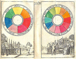
 "A color wheel is an organization of color hues around a circle." (http://en.wikipedia.org/wiki
/Color_wheel#History) A color wheel has 12 colors that are each in equal steps. The three primary colors ( red, yellow, and blue) are the three main colors, these colors are separated in the color wheel by three equal spaces on either side. The colors that are equally spaced between the primary colors are the secondary colors, these colors are mixed using the primary colors. Blue + yellow = green, yellow + red = orange, red + blue = violet. The colors that take up the space in between the primary colors and the secondary colors are call the tertiary colors. These colors are red-orange, red-violet, yellow-orange, yellow-green, blue-violet, and blue-green. There are also these things called complimentary colors, these colors are opposites on the color wheel or "opposite in 'hue'"(http://en.wikipedia.org/wiki/Complementary_color). A few examples of this are: red and green, blue and orange, violet and yellow.
In 1611 an astronomer, priest, and Neoplatonist Aron Sigfrid Forsius created the first color system. "In his color circle, between the colors Black and White, Red has been placed on the one side since the classical antiquity, and Blue on the other; Yellow then comes between White and Red, pale Yellow between White and Yellow, Orange between Yellow and Red."(http://www.coloryourcarpet.com/History
/ColorHistory.html). Franciscus Aguilonius created his own color diagram in 1613, this had to do with his work that he did with optics. It didn't come until 1672 when Isaac Newton came up with the first color wheel.
http://webexhibits.org/colorart/color.html
http://www.coloryourcarpet.com/History/ColorHistory.html
Image-http://en.wikipedia.org/wiki/Image:Boutet_1708_color_circles.jpg

 The different companies in the world decide on the colors that they make their products. These two objects, the school bus and the base of the lamp post, are yellow because they are objects that need to stand out. The school bus needs to stand out for the safety of the students that are riding it. The base of the lamp post needs to stand out because if it didn't stand out then people could possibly run their cars into it. If these objects were any different color they might not stand out quite as much and people might get hurt....it's a safety thing.


 An optical illusion is when images are placed in a certain position which causes the image to be misleading. The information that is then collected by the eye is processed by the brain and makes the brain think that it is seeing something completely different. A physiological illusion is where the effects on the eyes and brain of excessive stimulation of a specific type (brightness, the tilt, the color, movement). A cognitive illusion is when the eye and brain make unconscious conclusions from evidence or reasoning. Color optical illusions are caused by the different colors being placed next to each other. Many optical illusions are errors of sense, judgment, defects of the optical system, and many are caused my certain characteristics of the visual process.

